

Hooked on Phonics
Conducting an evaluation of Hooked & Company’s checkout experience.
Background
Hooked & Company
The Goal
Evaluate Checkout Experience
Defining Expectations
Tasks
Role:
Tools:
Timeline:
Team:
Client:
UX/UI Designer, UX Researcher
Figma, FigJam, Google Suite, Zoom, Panelfox
4 Weeks
Matthew Thien, Nallely Martinez Almonte, and Sara Her
Hooked & Company
Hooked & Company, home of Hooked on Phonics, has been trusted with improving children’s literacy since the 1980s. They’ve been serving parents of struggling readers, kids looking to get ahead in school, and homeschoolers by offering a comprehensive reading program for families to use at home (for kids ages 3-8).
In the Spring 2025 semester, my team and I at Pratt Institute’s DX Center, partnered with Hooked & Company to evaluate their checkout experience. Our goal was to understand the pros and cons of the checkout process and then report back to our client with a usability evaluation report.

To gain a deeper understanding of a participant’s pain points and needs, we chose to evaluate using remote, moderated usability testing sessions. Every member of the team would conduct two usability tests through Zoom, which would leave us with information from six participants in total.
What does our client need?
To start off, we held a kick-off meeting with Hooked on Phonics’ design leaders, Jamie and Luke to understand more about what they need from our team.

How do we want participants to interact with the website?
The tasks that we came up with were crucial in understanding what a person was looking for in the process. However, a lot of the information came from asking our participant to think aloud and asking the follow-up questions. With these methods, we were able to probe why they made the decisions that they did.
Scenario: You’re looking to improve your child’s reading development. You learned about Hooked on Phonics from a friend and are interested in learning more.
Task 1: For your first task, can you find the benefits of using Hooked on Phonics?
Task 2: On this page, can you find what the purchase provides?
Task 3: Can you also find what others are saying about the product?
Task 4 (checkout process): Finally, from this page, can you purchase a monthly subscription to Hooked on Phonics for your child?
Follow-up questions (Tasks 1-3):
How did that task go for you?
On a scale of 1-7, with 1 being very easy and 7 being very difficult, how difficult or easy was the task to complete?
Follow-up questions (Task 4 - checkout process):
On a scale of 1-7, with 1 being very easy and 7 being very difficult, how difficult or easy was the task to complete?
Were there any parts of the process that you were confused about?
Do you have any opinions on the aesthetics of the interface?
Ask the participant to clarify any thoughts or actions.
Participants
Who do we talk to?
While brainstorming tasks, we also thought about who we would be inviting to participate in our usability test. It’s important that we find people who fit the common demographic of a Hooked on Phonics buyer.
During our kick-off meeting, we learned that most users of Hooked Phonics were parents (more so mothers) between the ages of 25-45, looking for a reading product for their children between the ages of 3-6. Because of this, we ensured that our participants met this criteria. With Panelfox, we created a screener that allowed us to find participants easily while also ensuring that they were within our criteria.

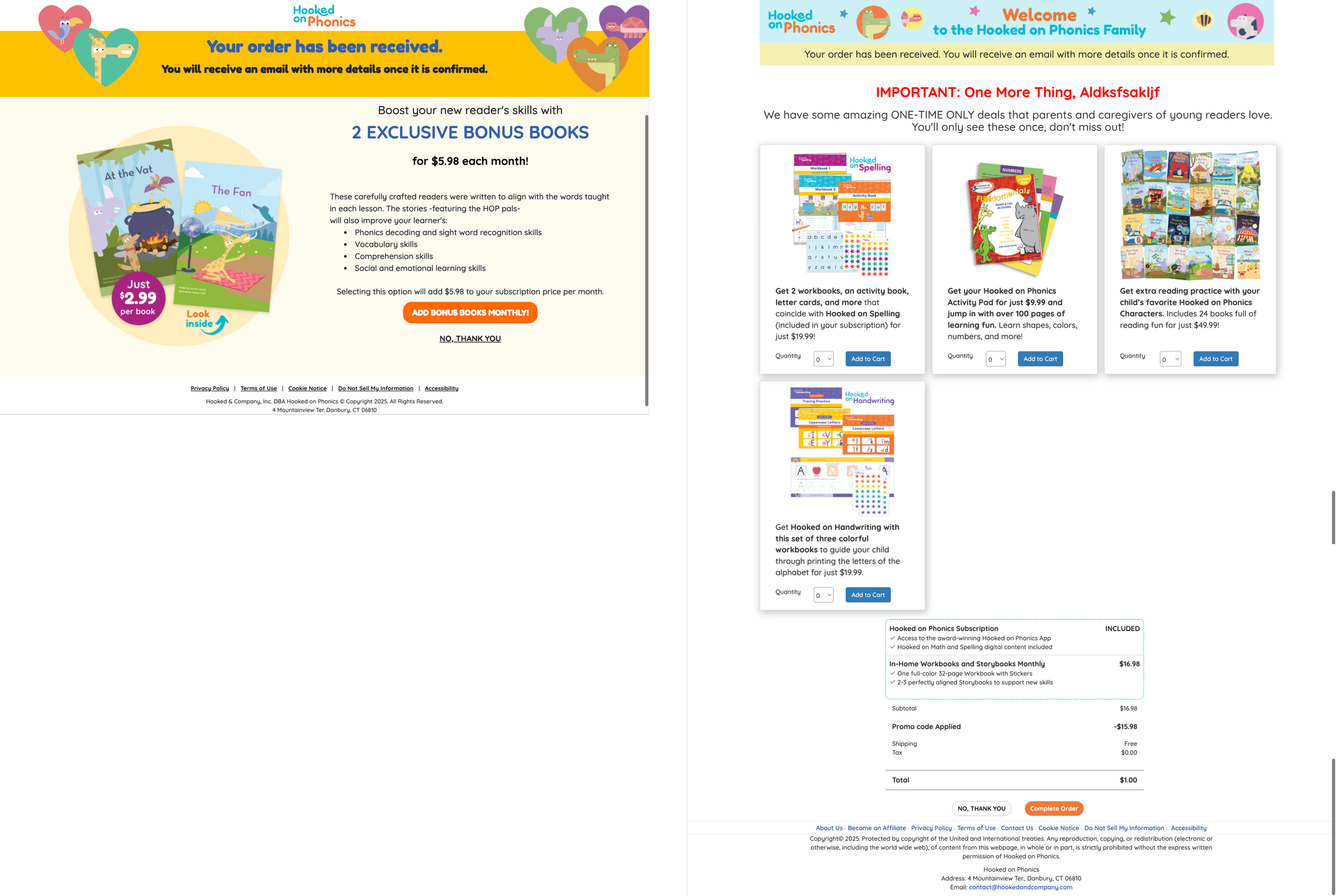
Issue 1
Upselling pages are inefficient and confusingly placed in the checkout process
In its current state, the two opportunities come in two different pages of the checkout process. This not only increases the steps required to complete the process but also increases the chance for user frustration. Along with it being two different pages, it is also two different designs. As stated by our users:
“Being offered even more stuff, and especially in a different format than the previous page, is a little bit confusing.”
Recommendation 1
Upselling pages should be combined for efficiency and moved earlier in the checkout flow to improve user clarity.
We recommend merging the two different pages. Doing this would reduce the number of steps in the checkout process and also make it so users can see every additional item they can purchase on one page.

Issue 1.1
The placement of the Upselling Pages is confusing
Although merging the two upsell pages fixes one issue with them, another issue that arose during our usability tests is that people assume the checkout process is complete after being shown the first upsell page. This means that they would exit the webpage and end the checkout process before they can get to the end.
During our usability testing, some of our participants had this to say about this part of the process:
“I would assume that [the process] is done, and I would just close the page if I didn’t want any of these books.”
This is the current checkout process:

Recommendation 1.1
Move Upselling Step to earlier in Checkout flow
After conducting research on different e-commerce websites, all of them have one thing in common: the confirmation page comes right after the payment page. According to our research, this seems like the most natural order of the checkout process.
Along with merging the two upselling pages, we recommend showing this page before the payment page. This aligns with standard checkout flows and leverages users' existing mental models, potentially improving conversion.

In this version, the upselling would happen before the payment page and after the “Reading Level” page. With this, users would have a more natural experience of selecting their child’s reading level, then have the opportunity to add relevant supplementary products to their cart, and finally proceed to payment. This aligns with a natural shopping sequence of selecting items and then purchasing.
Issue 2
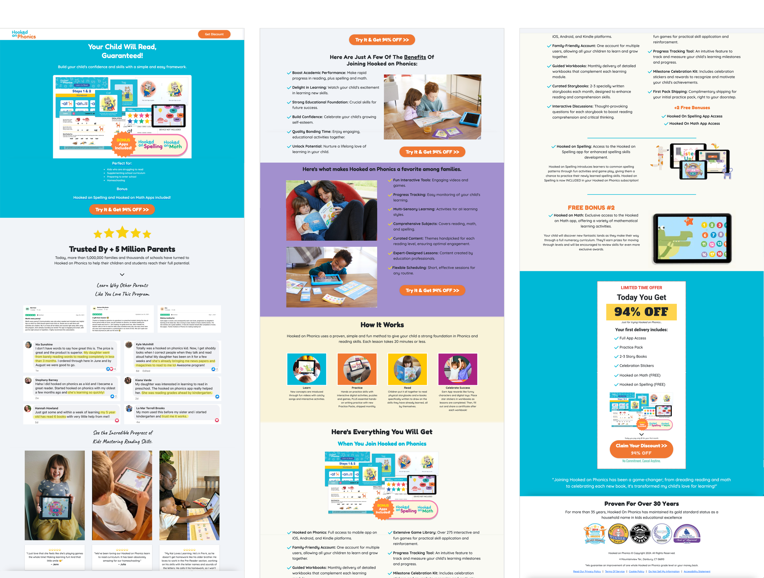
Information overload on the landing page
Upon arriving on the landing page to purchase the subscription to Hooked on Phonics, users are greeted with a lot of information . This leads to users feeling overwhelmed, skimming, or just skipping content on the webpage that they may need. Two users remarked upon taking in the webpage, “This is too much information,” and “What do I look at first?”
Of our six users tested, only two looked through the whole page, and only one took the time to read all of the content on there. Most users skimmed roughly the top third of the page only.
The current landing page includes the following content sections:
Your child will read, guaranteed
Reviews and Ratings
Benefits
What makes it a favorite among families
How it works
Everything you’ll get
Limited time offer
Proven to work for 30 years
Recommendation 2
Make landing page less overwhelming by removing content

We imagine the most important sections of the page are: "Your child will read", “Everything you will get”, “Reviews”, and
”How it works.”
Given that only two out of our six users actually read the whole page, and three didn’t make it past the “reviews and ratings” section, we recommend highlighting what’s offered right away
Second, we recommend keeping the “reviews and ratings” section but moving it to near the bottom of the landing page
We encourage moving it down as many users are familiar with finding ratings at the bottom of retail websites and to ensure that details around what users will get are highlighted first.
We believe the “how it works” section provides a good, general reminder of how the service works for users looking for that knowledge, and would follow the “everything you’ll get” section nicely.
Keeping the “proven to work for 30 years” section at the very end of the webpage serves as a strong source of credibility for users.
Issue 3
Users are confused about their purchase until late in the checkout process.
Although our participant critieria emphasized that they should not be familiar with Hooked on Phonics, we believe that the website should be able to explain what it is they are purchasing. However, insights from our usability study show that visitors weren’t aware of what they were purchasing until the payment page.
As a team, conducting user testing and comparing through other subscription-based platforms, we observed that the most effective sites use a combination of concise descriptions and clear visuals to communicate value.
Recommendation 3
Make it clear through tailored redesigns of sections what users are purchasing.
Part 1: Redesign “Here’s Everything You Will Get” on the Landing Page
Before

After

Conclusion
In the current design, it lists out the incldued items but the issue is that the hierarchy of information can be greatly improved. Each item list is accompanied by a text-heavy paragraph which makes it difficult to read even though the item is bolded.
There’s also no strong visual separation between the main offer and the bonus content. This could cause the bonus content to be completely overlooked
With our redesign, the layout has been simplified and optimized for a better reading experience. We made sure to follow Gestalt’s Principles of Proximity to ensure that users can quickly scan the text.
Part 2: Redesign the Checkout Page Sidebar
Before

After

The original layout focuses on structure and clarity but leans toward a more transactional and rigid presentation. It separates the items well, but lacks warmth and feels a bit clinical.
In contrast, we made the redesigned version much more structured and transparent. With this redesign, we worked on separating the subscription and physical terms into different sections to achieve a much more organized layout.
How did Hooked & Company Respond?
At the end of the project, we presented our findings and recommendations to Jamie and Luke and they had a lot of positive feedback. Before coming to our team, they conducted their own usability testing and had a lot of similar insights to us. We were able to validate their own insights which will provide them the confidence needed to move forward with improving the checkout process. If we had more time, we would definitely love to work more to conduct testing on our solutions.

I’d like to thank Jamie and Luke for this opportunity to learn.
I’d especially like to thank my teammates Sara and Nallely for a pleasant and fun time working together!