6m read
780 words
Building an unofficial design system for ClassPass
Role
Product Designer
UX Researcher
Tools
Figma
ZeroHeight
Timeline
8 weeks
Team
4 Design System Leads
CONTEXT
ClassPass is a monthly membership that enables you to book fitness services via their app.
ClassPass' parent company recently merged with another fitness giant, increasing their company evaluation to $7.5B.
PROBLEM
ClassPass is worth $7.5B but there are still major inconsistencies on the mobile app
Excessive text styles
There is an excessive amount of text styles that exist within the app.
Inconsistent button styles
Button styles are used inconsistently within the core flows.
SOLUTION
Introducing Hercules Design System
Hercules is an unofficial design system built by reverse-engineering the ClassPass product. The name reflects a core ClassPass value, no pain, no gain.
How did we get here?
PART 1
Deconstructing the ClassPass mobile app
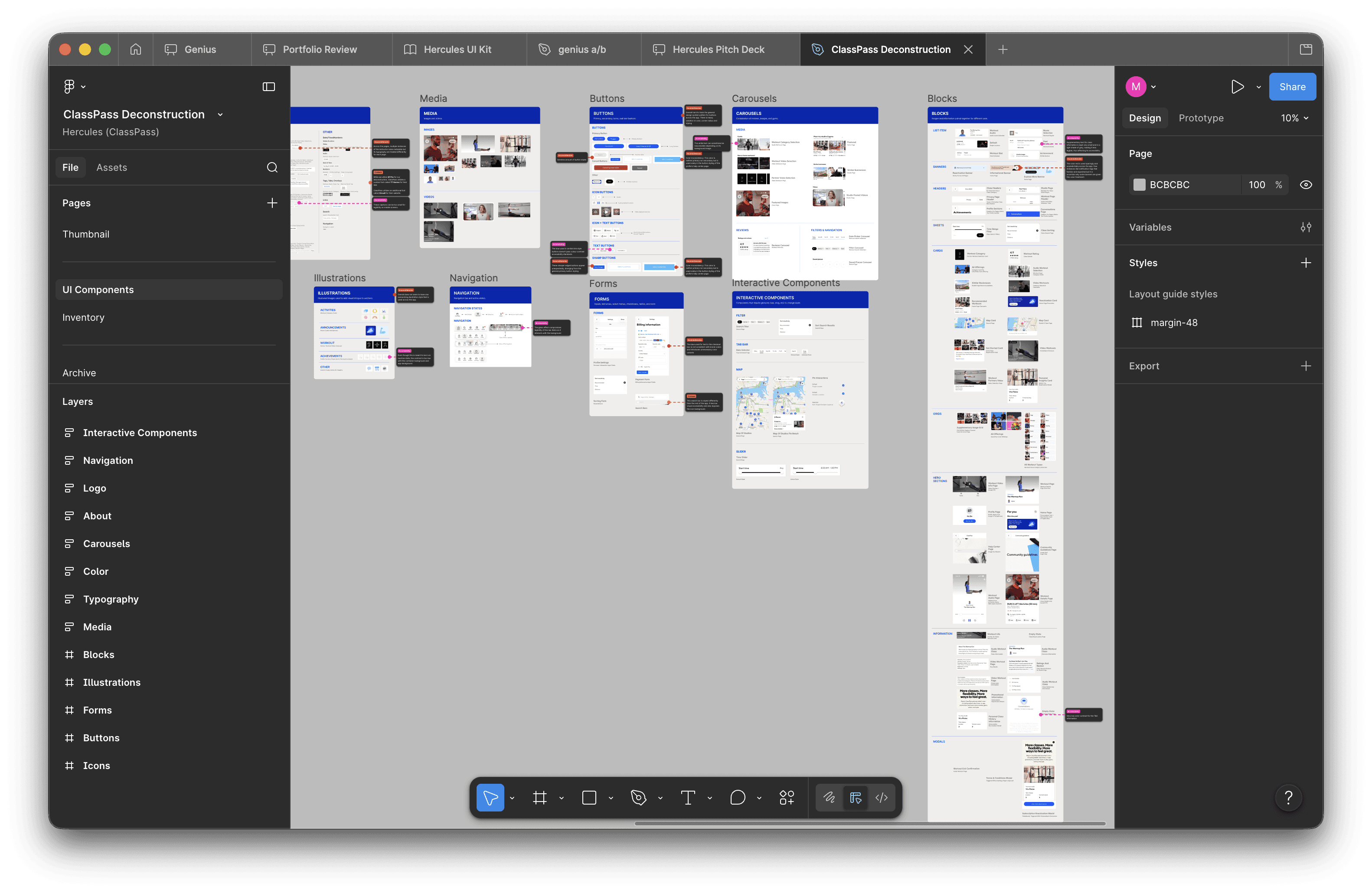
Before designing the system, we had to understand what we were working with. That meant identifying the key components and foundational elements of what we believe are the ClassPass mobile app's most visited pages: Home, Studio, Search, and Workouts.
We began bucketing every single UI element into atoms, molecules, and organisms, as per Brad Frost's atomic design guidelines. Atomic design gave us a common framework so we could hand off work without confusion
*ClassPass has both a website and a mobile app but because users mainly utilize the app to book their services, it would be more impactful to standardize that.
IDENTIFYING THE PROBLEM
Uncovering the inconsistencies in typography and buttons
While deconstructing, we found glaring issues that we couldn't ignore. We identified 14 different styles in total and inconsistent usage of button styles. As the fitness industry consolidates and ClassPass grows, the need for consistency increases as it is a core piece of good branding.
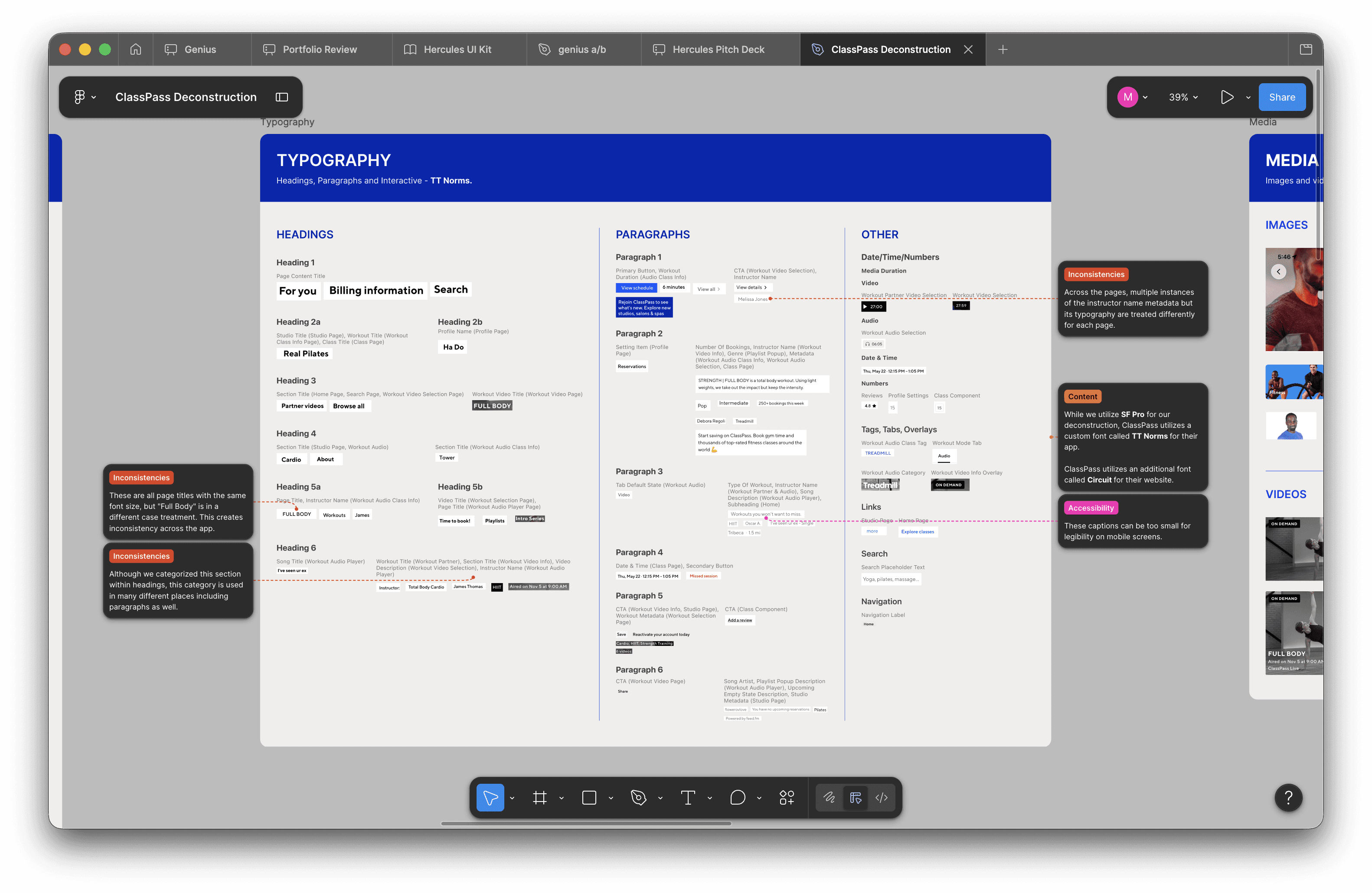
Screenshot of the typography styles we found
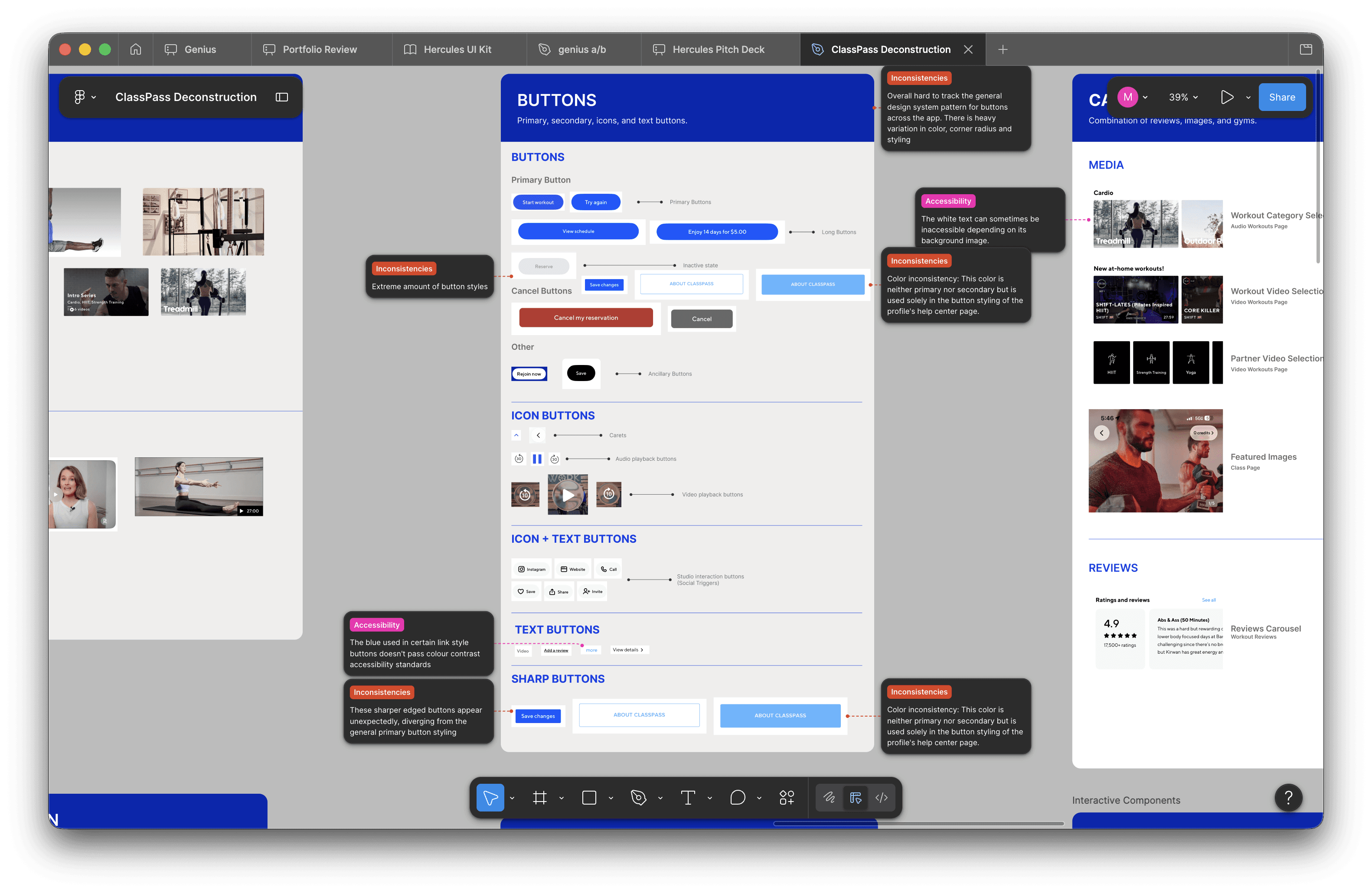
Screenshot of the button styles we found
PRINCIPLES
Defining the principles that guide Hercules
Before building components or defining tokens, the system needed a set of principles to guide every decision that followed and ensure consistency across the system at scale. In hindsight, our principles were not referenced enough. If I had the opportunity to do this again, I'd establish principles at the very start and use them as a filter for every component decision.
Clarity over cleverness
Understandable and usable
Frictionless by default
Low commitment: ClassPass's core promise, built into the system
Inclusive by construction
Accessible and inclusive, not bolted on
Crafted with feeling
Enjoyable, delightful, human
Consciously scalable
Built to grow without breaking
PART 2
Building the UI Kit
After identifying a problem, we moved into building a scalable and efficient design system that can alleviate those issues. Using Figma, we created a comprehensive UI kit with proper foundations, reusable components, and modular patterns to streamline the design and development process.
TOKEN SYSTEM
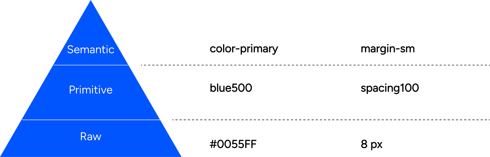
Raw, primitive, and semantic tokens
Hercules uses a three-tier token architecture.
Raw tokens define the base values — every color, size, and weight available in the system.
Primitive tokens give those values meaning by organizing them into a structured palette.
Semantic tokens tie everything to intent, mapping values to specific use cases like surface, text, and interactive states.
This hierarchy keeps the system flexible at the foundation and consistent at the surface. We chose to utilize the kebab-case because it's a widely used system that designers and developers everywhere can understand.
CONTRIBUTIONS
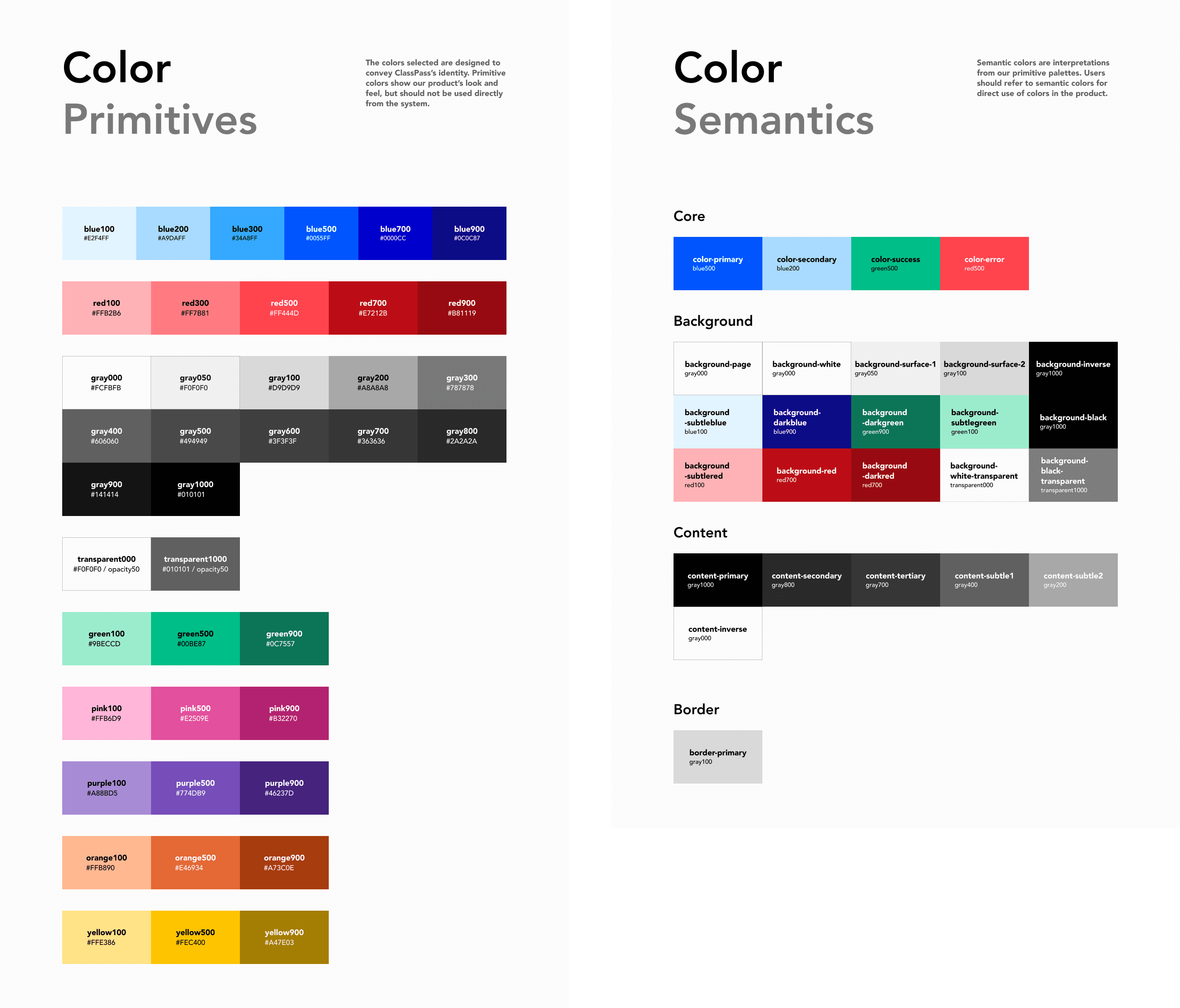
Standardizing color, spacing, and layout grids
I standardized the color system to ensure that decisions are intentional and consistent across every component and screen. Instead of designers and developers picking raw hex vales, every color in the UI now connects to a token with a defined purpose. This makes the system easier to maintain, scale, and hand off.
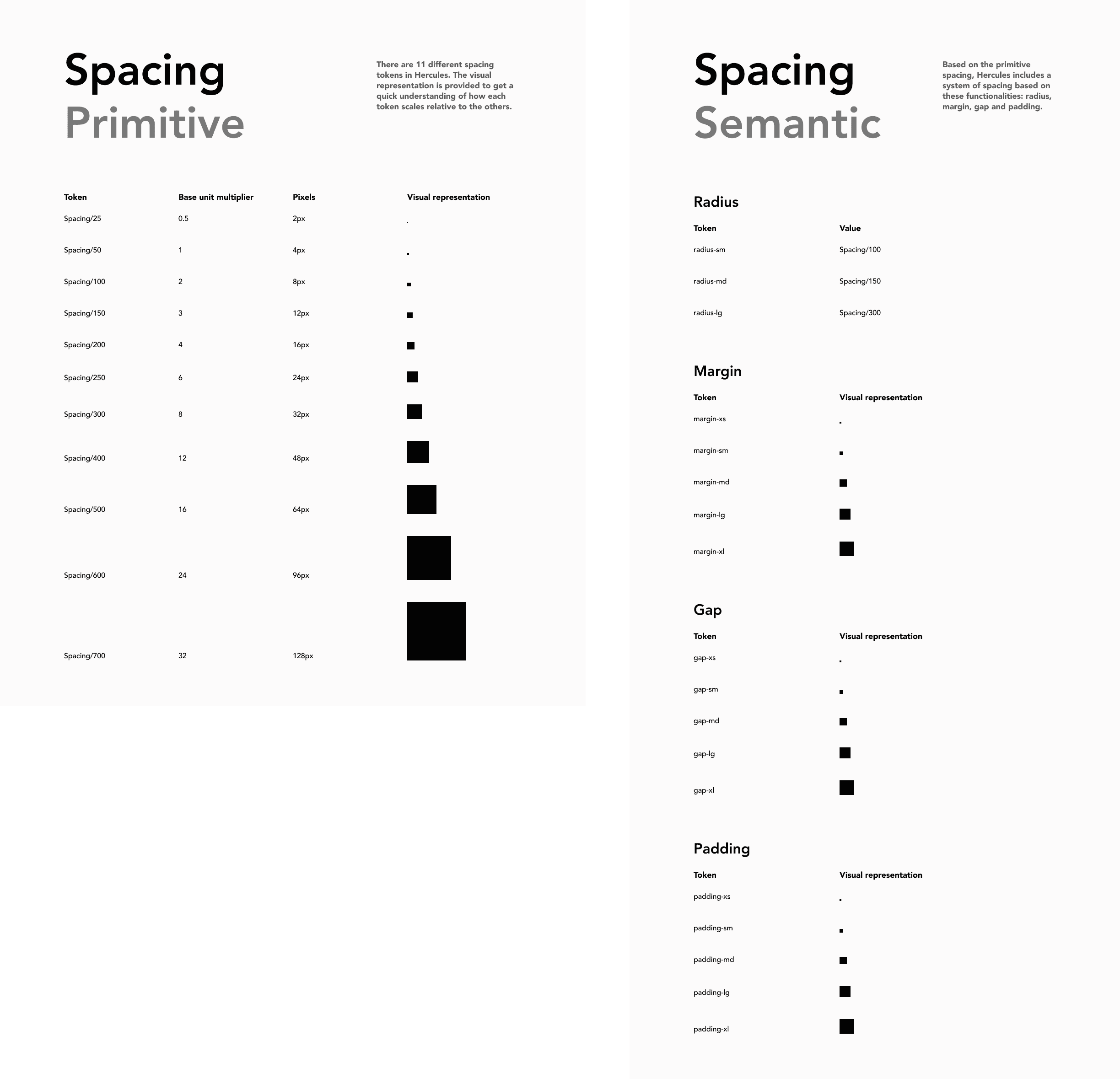
I also standardized the spacing system across the UI. There are now 11 different spacing tokens that are referenced for semantic tokens. This makes layouts feel cohesive, speeds up design decisions, and ensures engineering implements spacing the same way every time.
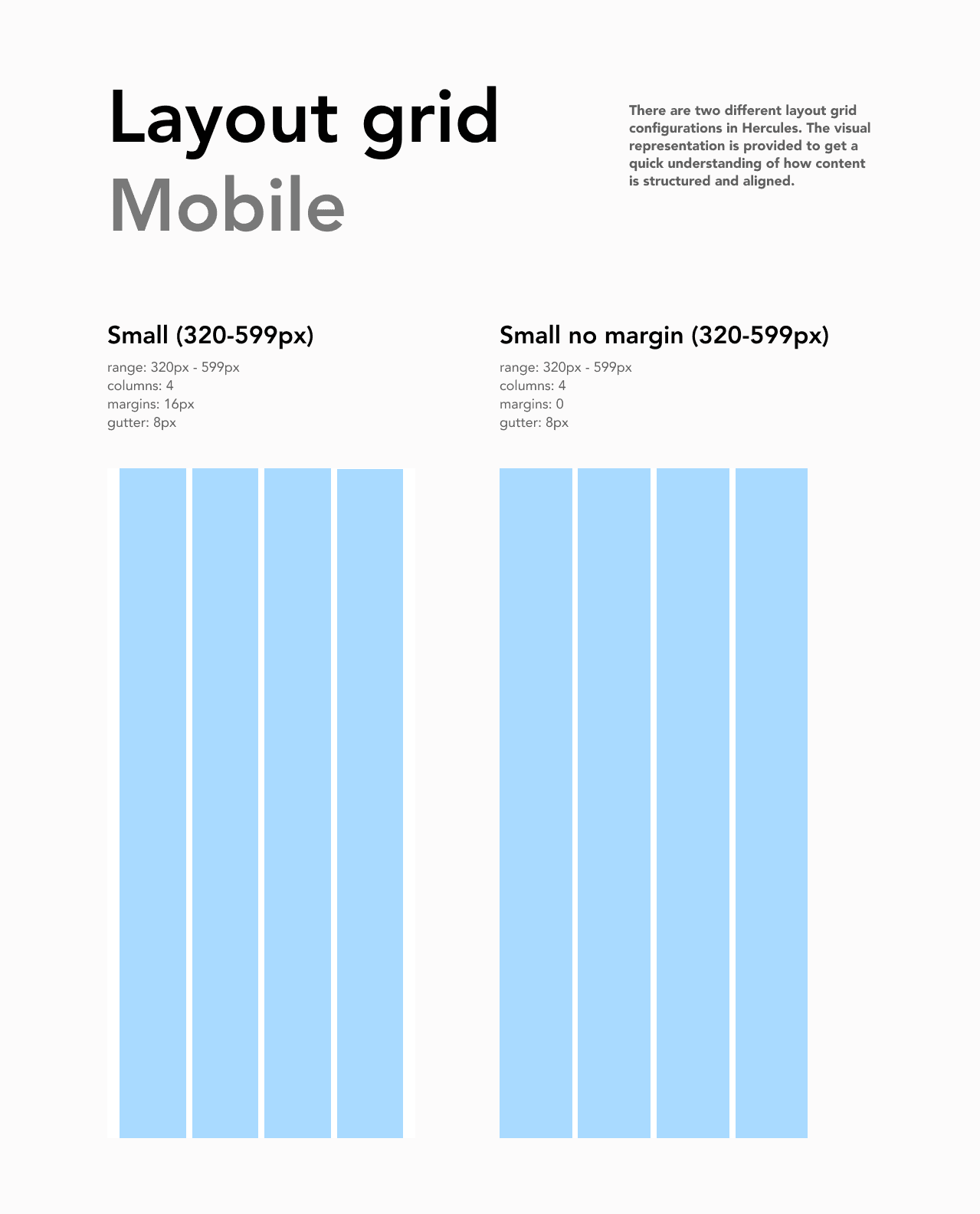
I established a 4-column responsive grid system based on common breakpoint standards. This ensures that every screen is structured the same way with consistent margins, gutters, and padding.
CORE COMPONENTS
Core components & patterns
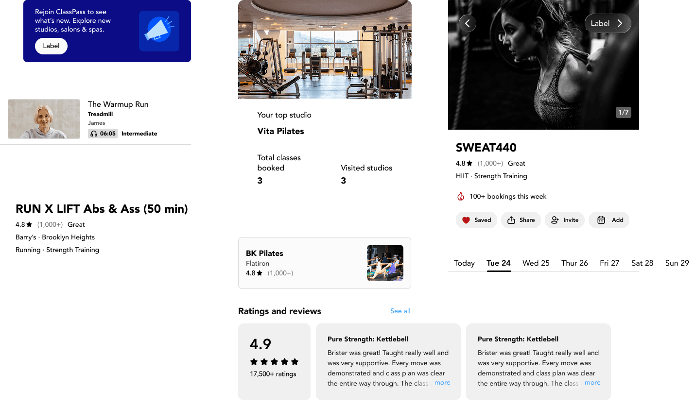
The Hercules design system documents recurring designs found across the ClassPass product. This allows designers and developers to build with confidence and with speed. It also ensures consistency; every button, card, and carousel behaves the same way across the product.
USER TESTING
Designers love our system but it can be improved
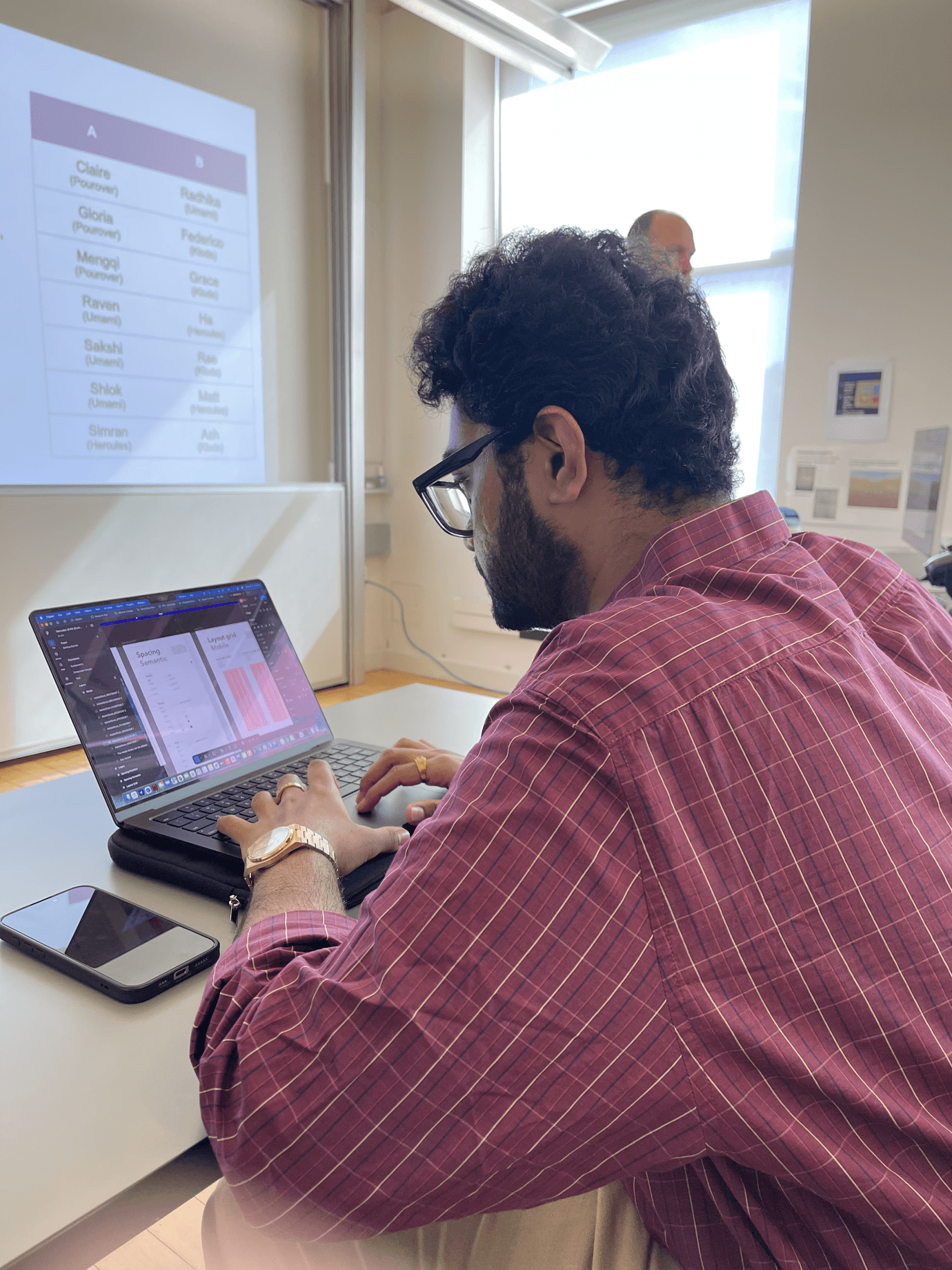
After our initial prototype, we conducted 3 user tests with other designers in our class. We asked our participants to recreate a screen using our design system and 3/3 successfully completed the task.
The test also revealed some typography issues within the containers that house the UI elements. That pushed us to revisit the visual hierarchy of the UI kit before pushing to public. Our designers had this to say:
"The process was pretty straightforward."
"There wasn't really anything confusing."
DOCUMENTATION
More than just a UI kit
A design system is more than a UI kit; it's a shared language that requires documentation, context, and rationale behind every decision. Hercules is documented in ZeroHeight, where design principles, accessibility standards, components, and best practices live in one accessible place.
ADOPTION
Tracking KPIs for success
How would we know if the design system works? If ClassPass were to implement Hercules, there would be specific KPIs that could be tracked to act as proof of concept.
Percentage of components reused
If percentage is high, that means that designers/developers are spending less time remaking components.
Time saved per designer/developer for designs
Time saved on designs could mean faster implementation
Accessibility compliance scores
Hercules enforces accessibility at its core. When screens are built with components from Hercules, those accessibility standards are inherited.
Booking conversion rates
While not a direct translation, if booking coversion rates go up, that could be a positive sign for the design. That means that there are no bumps in the journey and the design system is working.
NEXT STEPS
Expand Hercules to make more comprehensive
With more time, we would expand the design system to contain UI elements from the whole app. As of version 1, we only deconstructed four of the main flows but the goal is a complete, living system that scales with the product.
OUTCOME
We built a design system for ClassPass from 0 -> 1
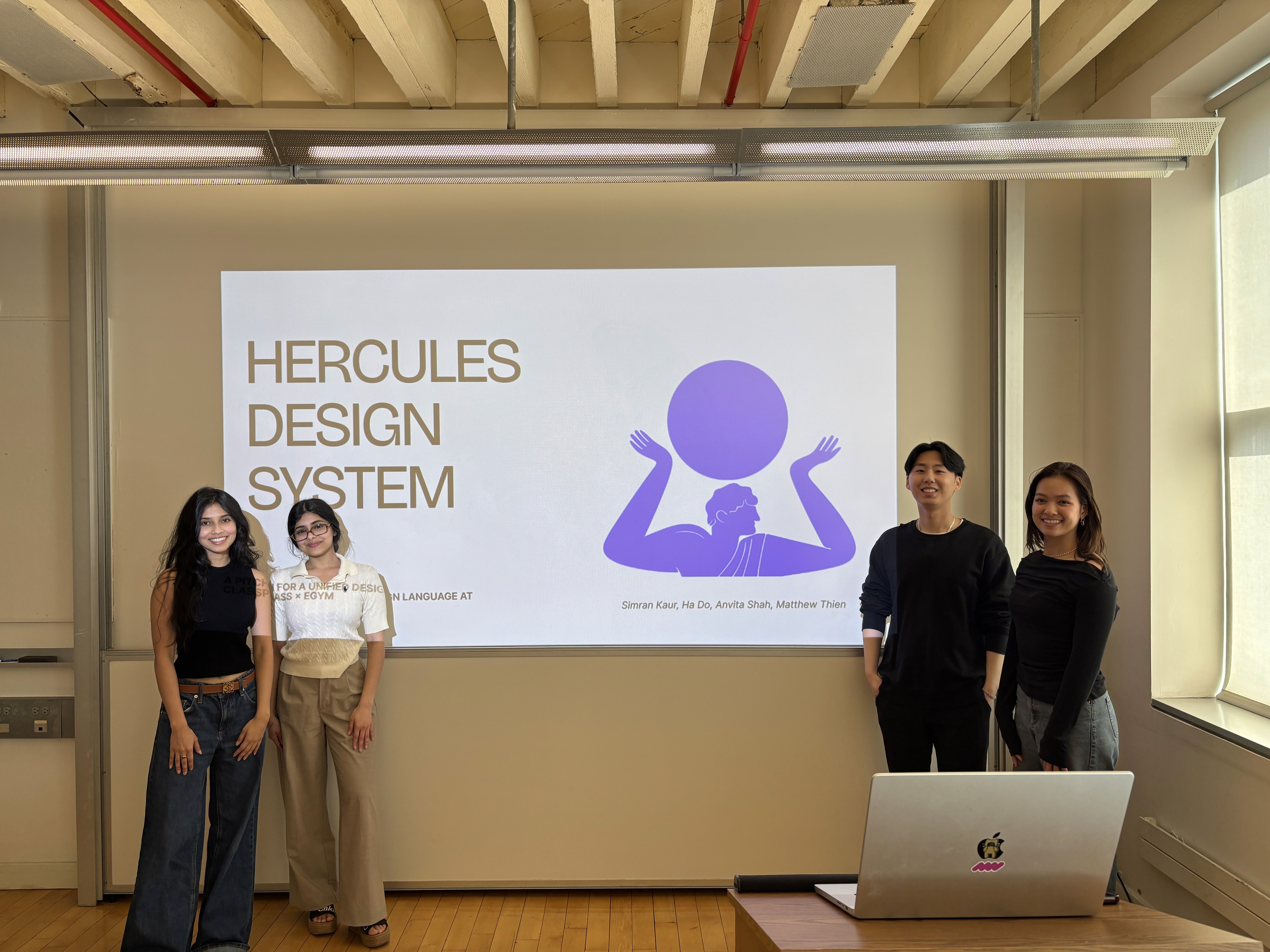
Upon completion, we pitched our design system in a fictional meeting with C-suite members. We were able to clearly communicate why a design system matters, how it supports efficient cross-functional collaboration, and how it can benefit ClassPass as it grows.
LEARNINGS
Good foundational work cascades
I learned that when projects start off well and have a good foundation, that works snowballs and everything will be easier later on. For our project, our foundations were a little shaky so there were moments when we revisited specific parts of the UI kit or the documentation and reevaluated our structure. If I were to do this project again, I would spend more time in our foundations. This includes token structure and file structure.