
prod
Designed a mobile digital intervention that assists students with managing their time while also educating them about time management techniques.
Role
UX/UI Designer, UX Researcher
Tools
Figma
Timeline
8 weeks
Students are not utilizing time management
The Problem
Students are having an increasingly hard time staying productive, due in part to a lack of knowledge about time management techniques. One survey of 500 people done by Acuity Training shows that only 82% of people utilize a time management system. Improper time management can lead to negative effects like stress, anxiety, and other mental health issues in addition to decreased academic performance.
Background
Leading up to prod
In October 2022, I was tasked to start brainstorming ideas for my capstone project for BrainStation’s UX Design Bootcamp. I started to think about ideas that would be useful to me as well as many others. This led me to thinking about my time as an undergraduate student at Brooklyn College. During these years, I was always strapped for time because I had to juggle between doing coursework and doing my duties as the secretary of the Korean Culture Club. At the time I didn’t utilize any time management system but, I realized when brainstorming that it could’ve helped me greatly. This realization is what led to me deciding on designing a product that assists students with managing their time.

How might we assist college students get into a productive state of mind and ensure that they can stay productive in order for them to maintain good academic standing?
User Research
Interviewing students
In order to fully understand the users, I chose to interview college students who struggle with the issue of poor time management. I made sure to ask them to tell me about their experience with procrastinating and why they think it occurs. Utilizing an affinity map, I learned that:

Key Insight
There are so many factors that have led to an increase in procrastination in students. Many students have tried to remedy this issue by attempting to use time-management techniques but the issue is that it can be difficult finding the motivation to start the task that they set out to do.
User Persona
Defining our user
Utilizing the information gathered from my interviews, I created a persona that best represents the user. This persona helps greatly with identifying the typical user’s needs and desires.
Defining what the user wants
User Stories
As a student, I want to be notified when my friends are starting to do work so that I feel motivated to start.
As a student, I want to share my progress on my homework so that I can motivate my classmates to start on their homework.
As a student, I want to see a list of previous work that I finished so that I can see how much progress I have made.
As a student, I want to use a time management technique so that I can divide up my work into parts.
I wanted to list out the different features that the potential user would need in order to identify the direction my product will go. I found out that the majority of my tasks focus on providing the users motivation to start their task.
Conceptualization
Finding Inspiration
Before I could start to sketch and visualize my screens and actions, I created an inspiration board consisting of different elements that I felt could work well with my product and brand.
Sketches & Wireframes
Exploration
The user stories and persona were a crucial guide to my UI decisions. The features implemented were ones that are beneficial to my persona.
While referring back to my sketches, I utilized Figma to create grayscale wireframes so that I can better visualize the functionality of my app.
Usability Testing
Finding what’s not working
To ensure that my app was working as intended, I conducted two rounds of usability testing. After each round of testing, I iterated on the design with all of the feedback in mind. Some feedback that I considered:

Implementing user feedback
Iterations
Because of testing, I was able to find out that there were a lot of improvements that could be made. There were situations where the user suggested that more information could be added in order to improve the UX. For example, adding the technique description screen.
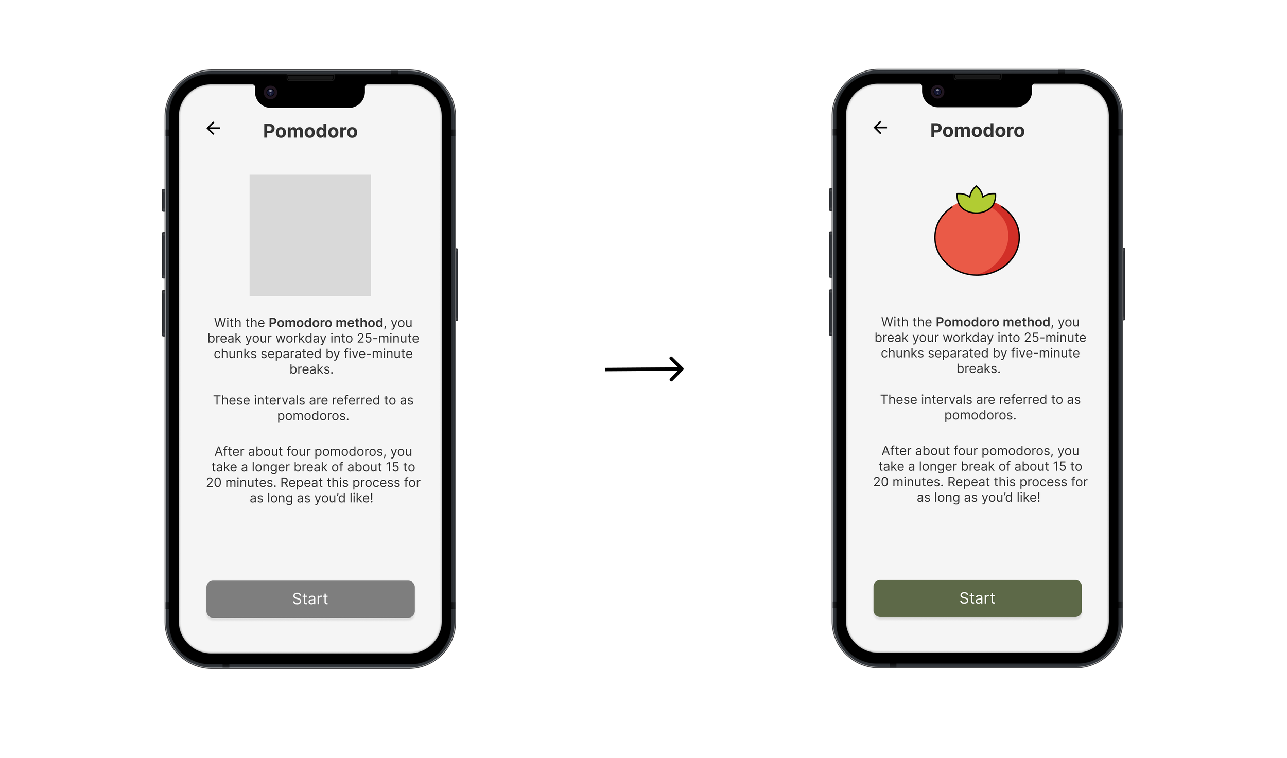
There were also several instances where the users were surprised when a screen would show up. To mitigate this, I created an onboarding experience to educate the users about the different features of the app.


Visual Identity
Color & Typography
With the help of a moodboard, I was able to extract several different colors that were suitable for my brand. These colors were present in many of the images I picked out as representation of my product and brand. I also had to ensure that my colors adhered to WCAG’s AA accessibility guidelines.
I utilized these colors and various fontstyles to convey different emotions to the user.
Differentiating
Social Aspect
After doing several competitive audits on existing apps that are designed to assist people with time management, I realized that my app would not stand out over them. That led me to looking back at my user interviews to find additional pain points and reviewing the needs of the users. There was one interesting quote I saw from my interview answers:
“I want to see what my friends are doing. ”

Prodding
This sparked the creation of prodding feature where the user can notify their friends that they have started doing work. With this feature, the user’s friends are now able to notify them when they are starting to be productive and vice versa. This can act as a motivator for both the user and their friends to start being productive.

Activity Feed
Along with the prodding feature, I designed a screen where the user will be able to see all of their friends’ activities throughout the week. The functionality of this screen enables the user to send a notification that commends their friends in the event of a productive day.
Final Design
Prod
My final design is the result of many user testing, UI iterations, and most importantly, user interviews. The app assists students by motivating them to start being productive and providing them different ways to stay productive.
Some features include:
Utilizing Different Time Management Techniques


Add New Tasks with Reminders, Due Dates, and Subtasks

View Completed and Upcoming tasks


Want to try the prototype? Click here!
Impact Measuring
What does success look like?
While the app has not been developed, there are several ways we can measure the impact when it goes live.
When it comes to measuring impact for the users, we have to look at key performance indicators (KPI). One KPI we can analyze to measure user impact is retention rate. This KPI measures the percentage of users who continue to use the app after a certain period of time, such as 30 days or 90 days. A high retention rate indicates that the app is effective in helping students manage their time.
Next Steps
Areas for Improvement
Expanding on usability testing & conducting more research.
Develop other core features such as adding friends, viewing personal profile, and setting priority for tasks.
Review my moodboard with intention to add more color in to Prod’s UI.
Conclusion
Takeaways & Key Learnings
I learned that trusting the process is important because everything that has been done is done for a reason. There were countless times when I referred back to past work like my task flow diagram, user stories, and user journey map.
Trust the process
Designing for the user ensures that my product is usable while also being desirable. Making sure that the user is not forgotten enables me to design apps that can fulfill the user’s needs.
Always keep the user in mind